Web Design Trends 2026: What's In, What's Dead, and What Actually Converts
Every year brings a fresh wave of web design trends, and every year most of them get adopted for the wrong reason: because they look impressive in a portfolio, not because they help a business grow. A site can win design awards and still fail to convert a single visitor into a customer.
So this isn't a mood board. It's a working guide to what's actually shaping great websites in 2026 — sorted by whether it earns its place. Some of these trends genuinely lift conversions. Some are pure decoration. And a few that dominated the last few years are now quietly hurting the sites that still cling to them.
Here's what's in, what's dead, and — most importantly — what moves the numbers.
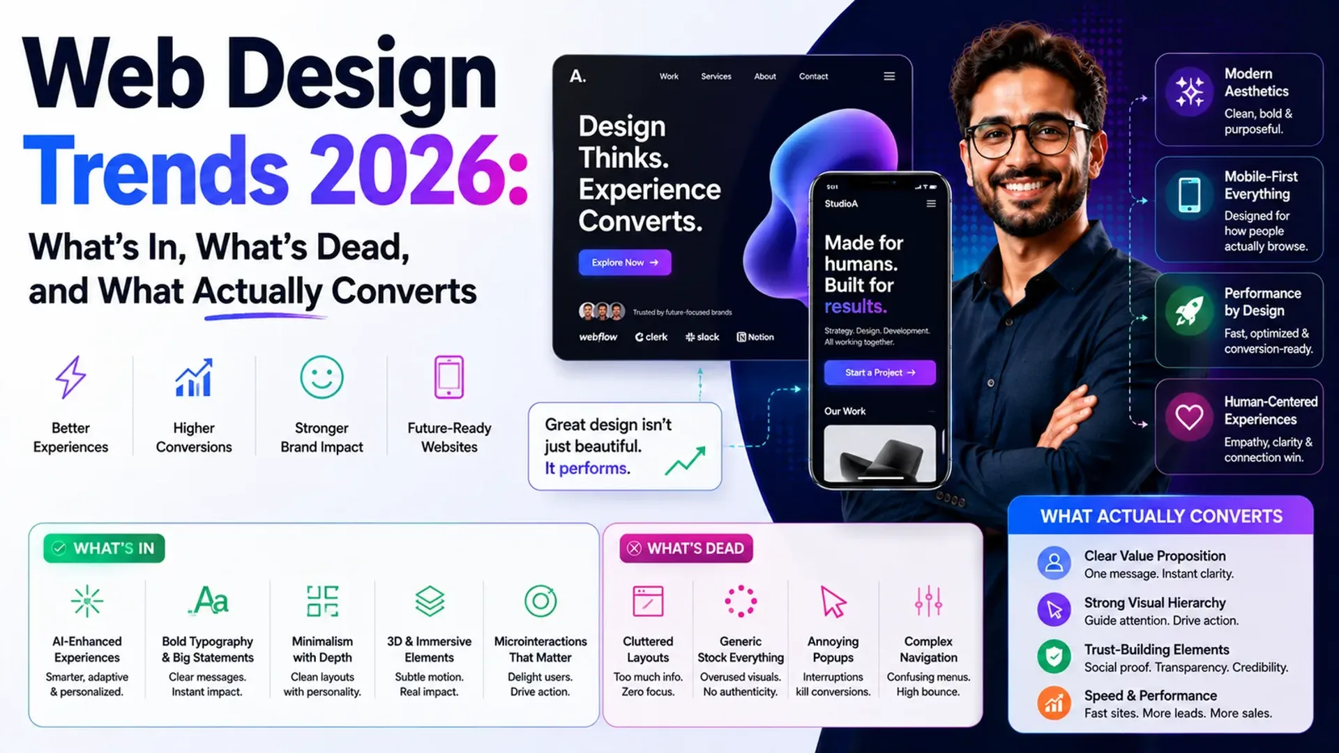
What's in (and worth your money)
These aren't just aesthetic fashions. Each one, done well, ties directly to how people experience and trust your site.
Bold, expressive typography
Large, confident type has become a primary design element rather than an afterthought. It sets tone instantly, improves readability, and lets you build a strong brand without leaning on heavy imagery. When your message is the hero, clarity goes up — and so does the odds someone actually reads your offer.
Purposeful motion and micro-interactions
Subtle animation — a button that responds, a smooth transition, a form field that confirms input — makes an interface feel alive and trustworthy. The keyword is purposeful. Motion that guides attention or gives feedback helps users. Motion that just shows off slows everything down. Thoughtful UI and UX design is what separates the two.
AI-driven personalization
Sites are increasingly adapting content, recommendations, and messaging to the individual visitor. Shown the right thing at the right moment, people convert more readily. This is where tools like an AI chatbot can shine — answering questions instantly and guiding visitors toward the next step instead of leaving them to wander off.
Accessibility-first design
Designing for everyone — proper contrast, keyboard navigation, screen-reader support, clear focus states — is no longer optional or niche. It's simply good design. It widens your audience, reduces legal risk, and, conveniently, the same discipline that makes a site accessible usually makes it clearer and easier for everyone to use.
Performance as a design decision
Speed is a feature. A gorgeous site that takes five seconds to load has already lost a chunk of its visitors. In 2026, the best teams treat load time, responsiveness, and stability as core design constraints — not something the developers "fix later."
If a trend makes your site prettier but slower, harder to read, or harder to use, it isn't a trend. It's a liability.
What's dead (or dying)
Trends have a shelf life, and a few former favorites now do more harm than good. If your site still leans on these, it may be working against you.
- Heavy, autoplaying hero videos that tank load times and eat mobile data while saying very little.
- Intrusive pop-ups the instant you arrive, before a visitor has read a word or built any trust.
- Trendy-but-illegible type — ultra-thin fonts, low contrast, and "artistic" layouts that sacrifice readability for a look.
- Decoration-only 3D and animation that adds weight and distraction without helping anyone do anything.
- Generic stock-photo sameness — the interchangeable smiling-team-around-a-laptop aesthetic that signals nothing and builds no trust.
The pattern is consistent: anything that prioritizes spectacle over the visitor's actual goal is on its way out.
What actually converts
Here's the uncomfortable truth — many of the choices that move conversions aren't glamorous. They rarely go viral on design showcases. But they're what separate a site that looks good from one that performs.
- Clarity over cleverness. A visitor should understand what you do and what to do next within seconds. Confusion is the number one conversion killer.
- One obvious primary action per page. When everything is emphasized, nothing is. Give each page a single clear next step.
- Trust signals in the right places. Clear pricing, straightforward contact options, and genuine proof of work reduce hesitation right where decisions get made.
- Fast, frictionless mobile experiences. For most businesses, mobile is where the majority of visitors are. If it's clunky on a phone, it's clunky where it counts.
- Content that answers real questions. Design carries the message, but the message still has to address what the visitor actually wants to know.
Notice how few of these are "trends" at all. They're fundamentals. The best design work in 2026 uses the new tools and aesthetics in service of these timeless principles — never the other way around. If you want to see what that balance looks like in practice, our recent work shows design and performance pulling in the same direction.
How to apply this without chasing every trend
You don't need every trend on this list. You need the handful that fit your audience and your goals. A simple approach:
- Start with the goal. Decide what a successful visit looks like before you touch a single visual choice.
- Adopt trends that serve that goal. Bold type, purposeful motion, and personalization are worth it when they push visitors toward action.
- Cut anything that only looks good. If it doesn't help the visitor or the business, it's costing you — in speed, clarity, or attention.
Pairing sharp design with a smart marketing strategy is what turns a good-looking site into a genuine growth engine.
The bottom line
The web design trends of 2026 are exciting, but excitement isn't a strategy. Bold typography, purposeful motion, personalization, accessibility, and performance are in because they help real people. Autoplay clutter, pop-up ambushes, and illegible art-for-art's-sake are out because they don't.
Judge every trend by one question: does it help a visitor get where they're going faster? If yes, use it. If no, skip it — no matter how good it looks in someone else's portfolio.
Do I need a full redesign to keep up with 2026 trends?
Usually not. Many of the biggest wins — clearer messaging, faster load times, a stronger primary call to action, better mobile flow — can be achieved through focused improvements rather than starting from scratch. A redesign only makes sense when the underlying structure is genuinely holding you back.
Which trend gives the best return on investment?
For most businesses, performance and clarity win by a wide margin. A fast, easy-to-understand site with one obvious next step will almost always outperform a slower, flashier one. The visual trends matter most once those fundamentals are solid.
How do I know if a trend is right for my brand?
Tie it back to your audience and your goal. A playful, motion-heavy look suits a consumer brand aiming for energy; a calm, minimal, accessibility-first approach suits a serious B2B or finance audience. The right trend is the one that fits how your customers think and decide.
Want an honest read on which 2026 choices will actually move the needle for your site? Book a free call and we'll walk through what's worth doing — and what to happily ignore.
Related reading: design elements that convert · custom website vs builder
Want to see how your current site measures up against these standards? Get a free AI website audit in about 30 seconds.
Tap the button and Google will show you our new articles more often — in Search, Top Stories and AI Overviews.
Have a project in mind?
Let’s turn it into an intelligent product. Book a free 30-minute discovery call.
Start your project →