Marcus spent four months and $6,000 building the most beautiful website his accounting firm had ever had. Clean serif fonts. Stunning photography. A color palette his designer described as "sophisticated yet approachable." He showed it off at a networking event and got genuine compliments. Three months after launch, he'd had exactly two enquiries — both from people who already knew him.
The site looked great. It just didn't work.
This is the gap nobody warns business owners about: the difference between a website that impresses and a website that converts. Beautiful and functional aren't the same thing, and when you're paying for design, you need to know which one you're buying.
The following nine elements are what separate websites that generate enquiries from websites that generate compliments. If you've already read our post on why your website isn't generating leads, think of this as the practical design companion — the specific, visual decisions that either help or hurt your numbers.
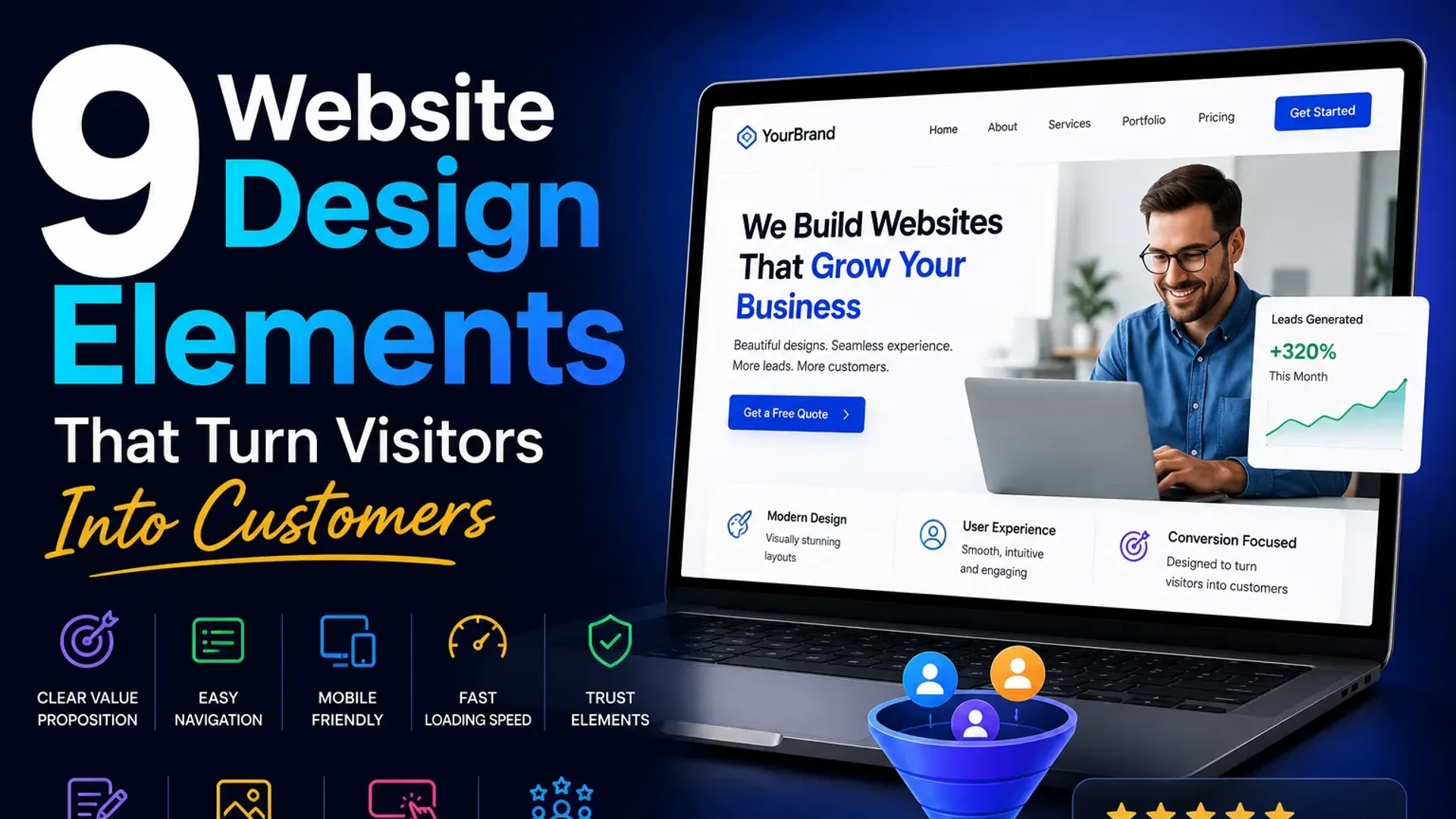
1. The 5-Second Hero Test
Open your homepage. Cover the navigation. Look at what's left. In five seconds, can a stranger answer three questions: What do you do? Who is it for? What should I do next?
Most business websites fail this immediately. The hero section — the large image or banner at the top of the page — is the most valuable real estate on your site, and it's routinely wasted on vague taglines like "Transforming Businesses Through Excellence" or a full-screen photo of a handshake.
A high-converting hero does this instead: it states what you do in plain English (not industry jargon), names the kind of customer you serve, and presents one clear next step. Something like: "Custom websites for Auckland service businesses — built to rank and designed to convert." Blunt. Specific. Immediately useful.
The photography matters too. Stock images of generic professionals in glass offices signal nothing. Real photos of your team, your work, or your product build more trust than any award badge.
2. One Primary CTA — Not Five
Here's a pattern that kills conversions silently: a website with a "Book a Call," "Download our Guide," "Watch our Video," "View Portfolio," and "Get a Free Quote" button all visible at the same time. Every option dilutes every other option.
When you give someone six things to click, they often click nothing. Decision fatigue is real, and your website visitor is making a choice in seconds, not minutes.
Pick one primary action you want visitors to take. Everything else is secondary. Your primary CTA button should appear in your hero, repeat in the middle of the page, and appear again at the bottom. It should be a different color from everything else on the page — not necessarily bright red, but visually distinct enough that it reads as "this is where I go."
Supporting CTAs (like "See our work" or "Learn more") should be text links or ghost buttons — visually lighter so they don't compete. One loud button per section is the rule.
3. Visual Hierarchy: Guide the Eye, Don't Hope It Wanders
Visual hierarchy is the design term for the order in which a reader's eye travels down your page. It's controlled by size, contrast, color, and spacing. Get it right and visitors flow naturally from your headline to your proof to your CTA. Get it wrong and they bounce, confused, without quite knowing why.
What this looks like in practice
- Headlines (H1, H2) should be dramatically larger than body text — not slightly larger. If you have to squint to see the size difference, increase it.
- Use whitespace aggressively. Cramped pages feel cheap and are hard to scan. Give sections room to breathe.
- High-contrast calls to action. A light grey button on a white background is functionally invisible to a skimming eye.
- Images draw the eye before text does. Make sure your images support your message rather than compete with it.
A simple audit: take a screenshot of your homepage and squint at it until it blurs. The things you can still identify are carrying the most visual weight. Is that weight on the right things?
4. Trust Signals in the Right Places
Trust isn't built by saying "we're trustworthy." It's built by showing evidence. But placement matters as much as presence.
Most business sites bury their testimonials at the bottom of the page — the graveyard of web design. By the time visitors scroll there, they've already decided whether to stay or leave. Move your strongest piece of social proof above the fold, or as close to it as possible.
The trust signal stack that converts
- A real testimonial with a real name and photo near the top of the page. "John M." with no photo is half as convincing as a headshot and a company name.
- Specific results, not vague praise. "The team was great!" is noise. "We went from 3 leads a month to 18 within 60 days" is signal.
- Logos of clients or partners (with permission) as a strip below the hero or near case studies.
- Review counts and star ratings from Google or a relevant platform, if you have them. Aggregate social proof is powerful.
- Any relevant credentials, accreditations, or media mentions — but only if they're genuinely recognizable. A logo nobody knows doesn't add trust; it just adds clutter.
5. Speed and Mobile-First — This Is Not Optional
53% of mobile users leave a page that takes more than three seconds to load. That's not a soft preference — it's a hard behavioral fact backed by years of Google data. And given that more than half of web traffic is mobile, a site that's slow or awkward on a phone is a site that's hemorrhaging potential customers.
Mobile-first design doesn't mean "make a desktop site and squeeze it." It means designing for the small screen first, then expanding. Buttons need to be large enough to tap (minimum 44x44 pixels). Forms need to work with a mobile keyboard. Text needs to be readable without pinching. Navigation needs to collapse cleanly.
Speed is a design decision as much as a technical one. Massive hero images, auto-playing video, too many third-party scripts — these are design choices that kill load time. A good web designer thinks about file sizes. A good web development team will optimize your site so it scores well on Google's Core Web Vitals, which directly affects your search rankings.
6. Forms That Don't Make People Work
A contact form is the finish line of your conversion funnel. Make it harder than it needs to be and people drop out right before the goal.
The rule is: ask for the minimum you need to take the next step. Name, email, a sentence about what they need. That's usually enough to qualify a lead and start a conversation. You don't need their phone number, their budget, their timeline, and their company size on the first touch — that's what the call is for.
Form friction you should remove today
- More than five fields for a basic enquiry form
- CAPTCHA that requires identifying traffic lights in grainy photos (use a modern invisible alternative)
- Fields that reset when you hit submit and there's an error
- No confirmation message after submission — people genuinely don't know if it worked
- A submit button that says "Submit" — use something like "Send My Enquiry" or "Book My Free Call"
One more thing: put a phone number or email address near your form. Some people, especially older customers or anyone in a hurry, will not fill in a form. Give them an alternative.
7. Scannable Layout for the Reader Who Won't Read
The average visitor reads about 20% of the text on a webpage. The rest they scan — running their eye down the left edge of the page, catching headings, bold words, and bullet points. Your job is to make that 20% count and to make the scan rewarding.
This means: break up long paragraphs. Use subheadings every few hundred words. Bold the key takeaway in a paragraph, not just random words. Use bullet lists for genuinely list-like content, not as a way to fragment sentences that would flow better as prose.
Write for scanners first, readers second. A visitor who scans and gets the point is more likely to actually read the bits that matter to them.
On service pages, this also means using icons or small graphics to chunk information visually. A page of six services listed as six paragraphs is harder to process than the same six services with icons and one-line descriptions, followed by details below.
8. Consistent Branding That Builds Familiarity
Inconsistent branding — three different shades of blue, two different fonts for body text, a logo that appears at three different sizes and in two different orientations — creates a subtle, background sense of unprofessionalism. Visitors can't always name it, but it affects how much they trust you.
Consistent branding doesn't mean boring. It means your color palette is defined and used deliberately. Your fonts are two, maybe three at most. Your imagery style is cohesive. Your tone of voice matches from the homepage to the about page to the contact page.
From a conversion standpoint, familiarity builds trust. When someone has visited your site, seen your social media, and received your email newsletter and all three feel like the same brand, they feel like they know you before they've spoken to you. That's an enormous head start.
If your brand feels scattered, UI/UX design work — specifically a design system or style guide — can resolve this without rebuilding your entire site.
9. An Above-the-Fold Value Proposition That Actually Says Something
The value proposition is the answer to "why you, and not the next person on the list?" It's different from your hero headline (which describes what you do) — it's the specific reason someone should choose you.
Weak value proposition: "We're passionate about helping businesses grow."
Strong value proposition: "We've built over 120 websites for New Zealand service businesses — and 80% of our clients see a measurable increase in enquiries within 90 days."
The strong version makes a claim. It has numbers. It's verifiable and specific. It gives a hesitant buyer a reason to proceed rather than keep shopping.
Your value prop should appear above the fold or very close to it — not buried in an "About Us" section halfway down the page. It answers the question your visitor is silently asking: "Why should I trust this company with my money?"
Actionable Takeaways
- Run the 5-second test on your homepage today — cover the nav and ask three people what you do based on what they see.
- Identify your one primary CTA and make sure it's the only thing on your page with that much visual weight.
- Move your strongest testimonial (with name and photo) to the top third of your homepage.
- Check your page speed on Google PageSpeed Insights — anything below 70 on mobile needs attention.
- Test your contact form on a phone. Fill it in with your thumb. Count the fields.
- Pull up your homepage on mobile and check that every button is tappable without zooming.
- Write your value proposition in one sentence, include a number, and put it on your homepage above the fold.
- Review your last three sections of body copy — can you cut 30% and lose nothing important?
Frequently Asked Questions
How do I know if my website design is hurting my conversions?
The clearest signal is traffic with no enquiries. If you're getting 500 or more visitors a month and fewer than 1–2% are taking action, your design is likely part of the problem. Install a free heatmap tool like Hotjar — you'll see exactly where people click, where they stop scrolling, and what they're ignoring.
Does my website really need to be redesigned, or can I just tweak it?
Often, targeted tweaks to the hero, CTA, and trust signals make a significant difference without a full rebuild. Start there. A full redesign makes sense when the underlying structure is wrong — poor mobile experience, slow load times baked into the theme, or a visual identity that doesn't reflect the business anymore.
What's the most important element for website design that converts?
Clarity beats everything else. A simple, fast, clear site with one obvious CTA will outperform a beautifully designed site that's confusing every time. If you can only fix one thing, make what you do and what the visitor should do next impossible to miss.
How much should good web design cost for a small business?
For a professionally designed, conversion-focused website for a small to mid-sized service business, expect anywhere from $3,000 to $15,000 depending on the scope, content requirements, and integrations needed. Template-based builds on the lower end, custom-coded sites on the higher end. The relevant question isn't what it costs — it's what it costs you to run a site that doesn't convert.
Should I prioritize design or SEO?
Both matter, and they're not in conflict. A well-structured, fast, mobile-friendly site is easier to rank. Good SEO sends traffic; good design converts that traffic. Doing one without the other means you're either getting visitors who bounce or building a beautiful site nobody sees.
What does "mobile-first" actually mean in web design?
It means the mobile version of your site is designed before the desktop version, not adapted from it afterward. The result is a site where the mobile experience is genuinely good — not a squished desktop version. Given that most searches happen on phones, this is the right default for almost every business website built today.
The Bottom Line
Good website design that converts isn't about following trends or picking the right shade of blue. It's about understanding that your website is a sales tool, and every design decision either helps a visitor move toward an enquiry or gives them a reason to leave.
Marcus eventually had his site rebuilt — not cosmetically, but structurally. Clearer hero, one strong CTA, testimonials moved up, form cut from eight fields to three. In the first month after relaunch, he had eleven enquiries. Same traffic, different design decisions.
If you're not sure which of these nine elements is doing the most damage on your site, the fastest answer is a fresh set of eyes. We offer a free website audit that looks at exactly this — the design, speed, structure, and conversion elements that are either working for you or against you. Or if you're ready to talk about a rebuild, the web development page has more on how we approach this work.
No obligation either way. Just clarity on where you stand.
Have a project in mind?
Let’s turn it into an intelligent product. Book a free 30-minute discovery call.
Start your project →