Your Ads Aren’t the Problem. Your Landing Page Is Probably Losing the Customers.
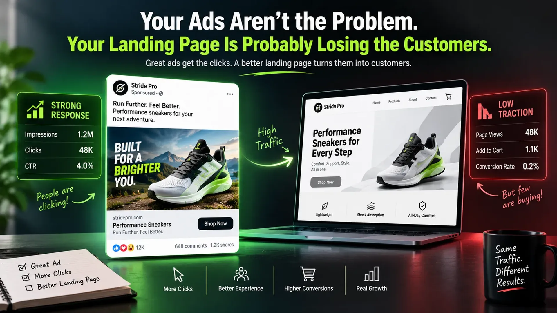
You spent $20,000 on Google and Meta Ads last month.
You got traffic.
You got clicks.
You got leads.
But somehow, the revenue still isn't where it should be.
So what do you do?
You blame the ads.
You ask the agency to improve the targeting.
You change the audience.
You create new creatives.
You increase the budget.
You try another campaign.
And then you wait for the numbers to improve.
But here's an uncomfortable question:
Have you actually looked at the page you're sending all those people to?
Because you can have great ads, strong targeting and a healthy media budget, but if your landing page doesn't convince people to take the next step, you're simply paying to send more people into a leaky bucket.
The problem may not be getting people to your website.
The problem may be what happens after they arrive.
Your ad gets the click. Your landing page gets the customer.
This is the easiest way to understand the relationship.
Your advertisement has one major job:
Get the right person interested enough to click.
Your landing page has a different job:
Convince that person to take action.
Someone sees your Meta ad.
They stop scrolling.
They read the headline.
They click.
Now they're on your landing page.
At that moment, you've already paid for their attention.
The next few seconds matter.
Can they immediately understand what you're offering?
Can they tell whether it's relevant to them?
Do they trust you?
Can they see proof?
Do they understand what happens next?
If the answer to those questions isn't obvious, don't be surprised when the visitor disappears.
Stop sending expensive traffic to a generic homepage
This is one of the most common mistakes we see.
A business runs an ad for:
“B2B Lead Generation Services.”
The person clicks.
Instead of landing on a page built around B2B lead generation, they arrive at:
CompanyName.com
The homepage talks about branding, web development, social media, SEO, consulting and ten other services.
The visitor now has to figure out where they fit.
That's unnecessary friction.
A dedicated landing page should continue the conversation started by the ad.
If the ad promises:
“Get More Qualified B2B Leads”
the landing page should immediately reinforce:
“We help US B2B companies generate more qualified leads through paid search, paid social and conversion-focused landing pages.”
Same audience.
Same problem.
Same promise.
No guessing.
Google's own guidance recommends that landing pages closely relate to the ads and keywords that send visitors there. Google Ads: Landing Page Experience
Your landing page has about five seconds to make sense
You don't literally have to hit a five-second timer.
The point is that people shouldn't have to work to understand your offer.
Imagine someone lands on your page and sees:
“Transforming Businesses Through Innovative Digital Solutions.”
Okay.
But what do you actually do?
Who is this for?
What am I supposed to do?
Now compare it with:
“Get More Qualified Leads From Google Ads Without Increasing Your Monthly Ad Spend.”
The second headline gives the visitor a reason to keep reading.
It tells them the outcome.
That's what your headline should do.
Stop making your landing page about your company
This is another big one.
Businesses love talking about themselves.
“We've been in business for 18 years.”
“We have a talented team.”
“We provide end-to-end solutions.”
“We are committed to excellence.”
None of these things are necessarily bad.
But they aren't the first thing your customer wants to know.
The customer is thinking:
“Can you solve my problem?”
Start there.
Talk about their problem.
Then explain your solution.
Then give them a reason to trust you.
Then ask them to take the next step.
Your landing page isn't an awards ceremony for your company.
It's a conversion tool.
A beautiful landing page can still be terrible at selling
This is where design teams and performance teams sometimes disagree.
The page looks incredible.
Beautiful animations.
Premium typography.
High-quality photography.
Smooth transitions.
Perfect spacing.
Everyone on the team loves it.
Then the conversion rate is 1.2%.
Why?
Because good design and good conversion aren't automatically the same thing.
A landing page needs to look good.
But it also needs to communicate clearly.
Sometimes the page with fewer animations and a much clearer offer wins.
Sometimes a customer testimonial beats a carefully designed illustration.
Sometimes a simple product demo beats a beautiful hero image.
The job of design is not to impress the marketing team.
The job is to help the customer make a decision.
More traffic won't save a bad landing page
Let's use simple numbers.
Suppose you send 10,000 visitors to your landing page.
At a 2% conversion rate, you generate:
200 leads.
Now imagine you improve the page to 4%.
The same 10,000 visitors generate:
400 leads.
You didn't double your traffic.
You didn't double your advertising budget.
You improved what happened after the click.
This is why landing page optimisation deserves serious attention, especially when businesses are already spending heavily on acquisition.
Unbounce's Conversion Benchmark Report analysed more than 41,000 landing pages, 464 million unique visitors and 57 million conversions, with a median conversion rate of 6.6% across industries in its dataset. Results vary considerably by industry, traffic source and offer, but the benchmark shows why conversion rate deserves to be treated as a serious performance metric. Unbounce Conversion Benchmark Report
But don't chase a “6.6% conversion rate”
This is important.
A benchmark isn't a target.
A landing page selling a $20 product shouldn't necessarily be compared with a landing page trying to generate enterprise software demos.
A B2C ecommerce page has different behaviour from a B2B consulting page.
A free trial has different friction from a $50,000 service.
Your goal isn't to hit some industry average.
Your goal is to improve the economics of your own funnel.
If your landing page goes from 3% to 4%, that may be a huge win for your business.
If it goes from 10% to 11%, that could also be significant depending on the economics.
Look at your numbers in context.
Your CTA probably says “Submit”
Why?
You just asked someone to give you their information.
And your final message to them is:
Submit.
That's not exactly inspiring.
Compare it with:
Get My Free Audit
Book My Strategy Call
Get My Custom Quote
Start My Free Trial
See How It Works
These tell the visitor what they're getting.
A good CTA reduces uncertainty.
It doesn't just describe the action.
Don't make people wonder what happens after they click
Let's say your CTA says:
Book a Consultation.
Good.
But what happens after that?
Do they immediately choose a time?
Does someone call them?
Do they get an email?
Is the consultation free?
How long is it?
Who will they speak to?
The more uncertainty around the next step, the harder it can be to convert.
Your landing page should make the process obvious.
For example:
1. Book a 30-minute call
2. We review your current marketing
3. You get a practical growth plan
That's much easier to understand.
Your customers don't trust you just because you say you're trustworthy
Every company says:
Trusted.
Reliable.
Experienced.
Results-driven.
Industry-leading.
These words are cheap.
Proof isn't.
If you say you deliver results, show results.
If you work with major companies, show the logos where you have permission.
If customers love you, show real testimonials.
If you achieved a measurable result, publish the case study.
Instead of:
“We help businesses grow.”
Try:
“We helped a US ecommerce brand reduce customer acquisition cost by 28% while increasing monthly revenue.”
The second statement gives the visitor something to believe.
Your testimonials should sound like customers, not your marketing department
This:
“Company X delivered a world-class experience and exceeded all our expectations.”
sounds like a brochure.
This:
“We had tried two other agencies before them. Within four months, our qualified leads increased significantly and the sales team finally had a predictable pipeline.”
sounds more believable.
Real people don't usually talk like corporate press releases.
Keep testimonials specific and natural.
Your case studies shouldn't be buried in the footer
If your landing page is asking someone to trust you with their money, show them what you've done.
A good case study should explain:
The problem
What wasn't working?
The approach
What did you change?
The execution
What did you actually do?
The result
What happened?
The lesson
What did you learn?
Don't just say:
“We helped Company X grow.”
Give people enough context to understand why your work mattered.
Your form might be scaring away good leads
Let's say your form asks for:
Full name.
Personal email.
Work email.
Phone number.
Company name.
Job title.
Company size.
Industry.
Monthly revenue.
Annual marketing budget.
Current agency.
Biggest business challenge.
How did you hear about us?
That's a lot.
Do you actually need all of it?
Maybe.
But every extra question introduces friction.
For many lead-generation campaigns, you can start with something much simpler:
Name
Work email
Company
How can we help?
Then qualify the lead later.
The right number of fields depends on your sales process.
The point is to stop collecting information simply because your CRM has a field for it.
But don't blindly make your form shorter
Here's the other side.
Sometimes qualification matters.
If your sales team only works with businesses spending $20,000+ per month on marketing, asking about budget can save everyone time.
If you're selling enterprise software, company size might matter.
If you're booking a technical consultation, asking about the project can be useful.
The question isn't:
“How short can we make this form?”
The question is:
“What information do we genuinely need at this stage?”
Mobile can quietly destroy your conversion rate
Your landing page may look perfect on your laptop.
Then someone opens it on an iPhone.
The headline wraps badly.
The CTA is halfway down the page.
The form is annoying to fill in.
The image takes forever to load.
The menu takes up half the screen.
The page looks completely different.
That's a problem.
Unbounce's benchmark data found that 83% of visits in its dataset came from mobile devices, which makes mobile experience impossible to treat as an afterthought. Unbounce Conversion Benchmark Report
Open your landing page on a phone.
Actually use it.
Don't just resize your browser window and call it mobile testing.
A slow landing page is an expensive landing page
Every extra second can create friction.
Especially when someone has arrived from a paid campaign.
You've already paid to get them there.
Don't make them wait for the page to load.
Google highlights page experience and landing page performance as important parts of advertising effectiveness, and specifically notes the potential conversion impact of mobile delays. Google Ads: Landing Page Experience
Compress your images.
Remove unnecessary scripts.
Optimise your code.
Review third-party tracking tools.
Use good hosting.
Test the page regularly.
Speed isn't exciting.
But it can be expensive when it's ignored.
Your offer might be the real problem
Sometimes the landing page isn't bad.
The offer is.
You can have perfect design and copy.
But if the offer is:
“Contact us to learn more.”
why should someone act now?
Compare that with:
“Get a free 30-minute conversion audit and find the three biggest leaks in your current funnel.”
Now there's a reason to take action.
Your landing page can't manufacture demand from nothing.
But it can make a strong offer much easier to understand.
Stop putting every service on one landing page
If you're a full-service agency, this is especially tempting.
You want to tell people about:
Branding.
Web development.
SEO.
Paid advertising.
Social media.
AI.
Content.
Automation.
UX/UI.
Strategy.
That's great for your company profile.
It's not necessarily great for a paid campaign.
If someone clicked an ad about Google Ads management, they don't need to see your entire service catalogue immediately.
Give them what they came for.
You can introduce the wider business later.
Relevance beats completeness.
Your landing page should answer objections before sales does
Every customer has questions.
Does this actually work?
Have you worked with companies like mine?
How much does it cost?
How long does it take?
What happens after I sign up?
What if I'm not happy?
Why should I choose you?
A good landing page answers as many of these as possible.
That could mean:
FAQs.
Case studies.
Testimonials.
Guarantees.
Process explanations.
Pricing guidance.
Client logos.
Results.
The fewer unanswered questions, the easier the decision becomes.
Don't confuse more content with more persuasion
Some businesses think a landing page needs 3,000 words.
So they add more.
And more.
And more.
Eventually, the visitor has to scroll through the history of the company, the founder's story, 18 features, 12 service categories and a paragraph about the company's mission.
Nobody asked for all of that.
The right amount of content is the amount needed to make the decision easier.
Some landing pages need 500 words.
Some need 2,000.
Some need 100.
Write until the customer has enough information to act, not until the page looks impressive.
Your landing page should feel like the next step
Imagine your customer journey as a conversation.
The ad says:
“We can solve this problem.”
The landing page should say:
“Here's exactly how.”
The proof says:
“Here's why you should believe us.”
The offer says:
“Here's what you get.”
The CTA says:
“Here's what to do next.”
That's a natural progression.
When each section feels disconnected, conversion becomes harder.
Don't measure the landing page only by leads
Here's another trap.
Landing Page A generates 300 leads.
Landing Page B generates 200.
Everyone celebrates A.
But then sales looks at the leads.
A produced 15 customers.
B produced 30.
Which one won?
Obviously, B.
This is why a landing page shouldn't be judged only by conversion rate.
Track:
Visitors
Leads
Qualified leads
Sales opportunities
Customers
Revenue
Customer acquisition cost
The page that generates fewer but better leads can be far more valuable.
Your performance agency should own more than the ad account
If your agency says:
“The ads are performing well. The landing page isn't our responsibility.”
you have a problem.
The customer doesn't experience your ad account separately from your website.
They experience the journey.
Ad → Landing Page → Lead → Sales → Customer
If the agency is responsible for performance, it should at least understand every major part of that journey.
And ideally, it should be able to improve more than the media buying.
That's where creative, UX, web development, analytics and performance marketing need to work together.
This is why landing page optimisation should be continuous
Your landing page isn't finished because you launched it.
Markets change.
Offers change.
Customers change.
Competitors change.
Your advertising changes.
Your data changes.
So your landing page should change too.
Look at the numbers.
Find where people are dropping off.
Read customer feedback.
Talk to the sales team.
Test new headlines.
Test new offers.
Test new proof.
Test different CTAs.
Improve the page based on evidence.
That's optimisation.
AI can give you 50 landing page headlines. It can't tell you which one your customer will believe.
AI is useful here.
It can help you:
Generate headline variations.
Rewrite CTAs.
Analyse customer reviews.
Identify common objections.
Create page structures.
Generate testing ideas.
But don't mistake output for strategy.
Ask an AI tool:
“Write 20 landing page headlines for a marketing agency.”
You'll get 20 headlines.
Most will sound perfectly acceptable.
But your customers don't need “perfectly acceptable.”
They need something relevant.
Specific.
Believable.
Different.
Something that speaks to their actual problem.
That's where human research and business context still matter.
The best landing pages are usually clearer, not cleverer
You don't need a headline that makes people stop and wonder what it means.
You need one that makes them immediately understand why they should care.
You don't need a complicated funnel.
You need a logical one.
You don't need 15 CTAs.
You need one obvious next step.
You don't need 40 testimonials.
You need a few credible ones.
You don't need every feature.
You need the features that matter to the customer.
Clarity wins.
Before you increase your ad budget, fix the leak
The next time someone tells you:
“We need more traffic.”
Ask:
“What are we doing with the traffic we already have?”
If thousands of people are clicking your ads but very few are becoming leads or customers, don't automatically buy more traffic.
Look at the page.
Look at the offer.
Look at the message.
Look at the proof.
Look at the form.
Look at the follow-up.
Look at the complete funnel.
Because the cheapest customer is often not the one you acquire with cheaper clicks.
It's the one you convert more effectively after you've already paid for the click.
A great landing page is not a web design project
It's a business growth tool.
It sits between your marketing and your sales.
It takes attention and tries to turn it into action.
That's why the best landing pages are built by teams that understand more than design.
They understand:
Customers.
Creative.
Advertising.
UX.
Copywriting.
Technology.
Analytics.
Sales.
When those disciplines work together, the landing page becomes more than a pretty page.
It becomes part of the acquisition engine.
So, do you actually have a great landing page?
Don't ask whether it looks good.
Ask harder questions.
Does it immediately explain what you offer?
Does it match the ad that brought the visitor there?
Does it clearly communicate the value?
Does it show enough proof?
Does it address objections?
Does it work properly on mobile?
Does it load quickly?
Is the CTA obvious?
Is the form asking for too much?
Does the lead get followed up quickly?
Are you measuring customers and revenue, not just leads?
If you answered “no” to several of these, your landing page probably needs work.
And increasing your ad spend isn't going to fix it.
Ready to Stop Paying for Clicks That Don't Convert?
At Alternate, we don't look at landing pages as isolated web projects.
We look at the complete customer journey.
Creative → Advertising → Landing Page → Conversion → CRM → Sales
Our team brings together strategy, creative, UX/UI, web development, performance marketing, SEO, AI and technology to build digital experiences around business outcomes.
Because getting someone to click is only the beginning.
The real job is turning that click into a customer.
If you're already spending money on Google, Meta or other acquisition channels, let's look at what happens after the click.
Your next growth opportunity might not be another ad.
It might be the page your customers are already landing on.
Tap the button and Google will show you our new articles more often — in Search, Top Stories and AI Overviews.
Have a project in mind?
Let’s turn it into an intelligent product. Book a free 30-minute discovery call.
Start your project →