The $10,000 Ad Mistake: What Happens When Your Landing Page and Ads Tell Different Stories
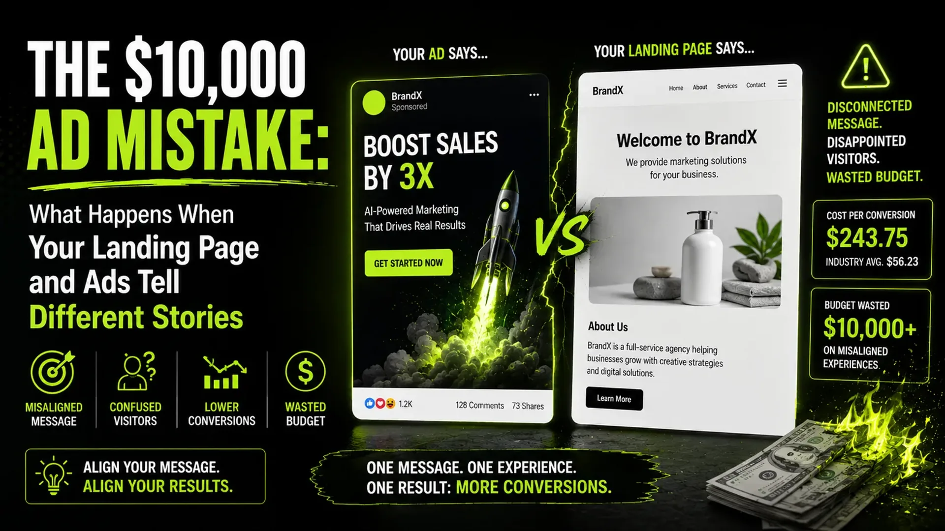
Let's say you have a good product. You have a decent offer. Your Meta ads are getting clicks. Your Google Ads are bringing traffic. The numbers inside your advertising dashboard look healthy. So you keep spending. $5,000. $10,000. $25,000. Then someone asks the question nobody wants to hear: “Why aren't we getting more customers?” The first instinct is usually to blame the ads. Change the audience. Change the creative. Change the campaign objective. Try another platform. Increase the budget. But sometimes the ads are doing exactly what they're supposed to do. They're getting people to click. The problem starts after the click. The customer arrives at your website or landing page and suddenly the story changes. The ad promised one thing. The page talks about something else. The ad showed a specific offer. The landing page makes the visitor search for it. The ad spoke to a particular problem. The landing page starts talking about company history. The ad felt simple. The website feels complicated. And just like that, the money you spent getting the click starts disappearing. Your ad didn't fail. The journey did.
A click isn't a conversion
This sounds obvious, but it's surprisingly easy to forget. A performance campaign can generate thousands of clicks and still produce disappointing business results. Why? Because a click is only the beginning. Think about the journey: Ad → Click → Landing Page → Interest → Trust → Action → Customer. Every step introduces friction. If 10,000 people click your ads but only 100 become leads, the question isn't simply: “How do we get more clicks?” It might be: “Why aren't the 9,900 people doing anything after they arrive?” That's a very different problem. And sometimes fixing that problem can be more valuable than buying another 10,000 visitors.
Let's put some numbers behind it
Unbounce's 2024 Conversion Benchmark Report analyzed more than 41,000 landing pages, 464 million unique visitors and 57 million conversions. Across all industries, the median landing-page conversion rate was 6.6%. Unbounce Conversion Benchmark Report That number isn't a universal target. A SaaS landing page, an ecommerce product page and a B2B lead-generation page have completely different conversion environments. But it gives us a useful reference point. Now imagine you're spending $10,000 on paid traffic. Your campaign generates 10,000 visitors. If your landing page converts at 2%, that's 200 conversions. If you improve the page to 4%, that's 400 conversions. Same traffic. Same advertising budget. Same audience. You just doubled the number of conversions. That's why landing-page optimization can be one of the most underappreciated parts of performance marketing.
The ad makes a promise
Every good advertisement makes some kind of promise. It might be: “Save 30%.” “Get your first consultation free.” “Reduce reporting time by 10 hours a week.” “Launch your website in 7 days.” “Get qualified leads without increasing your ad spend.” The customer clicks because that promise interests them. So what do they expect when they arrive? To see the same thing. That's where message match becomes important. If the ad says: “Get a free 30-minute consultation.” And the landing page headline says: “Welcome to our digital transformation company.” You've created a problem. The visitor didn't click because they wanted to learn about your company's digital transformation philosophy. They clicked because they wanted the consultation. The landing page should make that next step obvious. Something like: “Book Your Free 30-Minute Growth Consultation.” Now the journey makes sense.
The customer should never have to wonder, “Am I in the right place?”
This is one of the simplest tests you can perform on any landing page. Show someone your ad. Then show them the landing page. Ask: “Does this feel like the next step?” If they hesitate, you've got a problem. Because people don't want to solve a puzzle before buying something. They want confirmation. Yes, this is what I clicked for. Yes, this is the company I was looking for. Yes, this is the offer I saw. Yes, I understand what happens next. The faster you create that certainty, the less cognitive friction you introduce.
Your homepage isn't always your best landing page
This is another mistake businesses make. They launch a paid campaign and send everyone to the homepage. Seems logical. The homepage contains everything. Services. About us. Blog. Testimonials. Contact. Portfolio. Careers. Everything. That's precisely the problem. Everything is not always helpful. Imagine you're running an ad specifically for: “Shopify development for growing ecommerce brands.” The visitor clicks and lands on your homepage. Now they have to find the Shopify service. Then understand what you offer. Then find your portfolio. Then locate your contact form. Then figure out what happens next. Every additional decision creates another opportunity for them to leave. A dedicated landing page can remove much of that friction. It can focus on one audience, one problem, one offer and one primary action.
The landing page should continue the conversation
Think about advertising as a conversation. The ad starts it. The landing page continues it. For example: Ad: “Your website gets traffic. But how many visitors actually become customers?” Landing page: “Turn More Website Visitors Into Customers.” Then: Explain the problem. Show how you solve it. Provide proof. Address objections. Present the offer. Give the visitor a clear next step. That's a coherent journey. Now compare that with: Ad: “Increase your ecommerce conversion rate.” Landing page: “Welcome to XYZ Digital Solutions.” The conversation has completely changed. It's like someone asking: “Can you help me fix my website?” And you responding: “We've been in business since 2012.” Interesting. But not the answer they came for.
Your landing page has one job
Not five. Not ten. One. That doesn't mean every landing page has exactly one button. It means there should be one primary conversion objective. For example: Book a demo. Request a quote. Start a free trial. Buy the product. Download the guide. Schedule a consultation. Everything on the page should support that action. If your primary CTA is “Book a consultation,” but the page has equally prominent buttons for Read our blog, View our services, Follow us on Instagram, Learn about our company and Download our brochure, you've given the visitor five different escape routes. That's not always bad for a website. It can be bad for a conversion-focused landing page.
Your headline is doing more work than you think
People don't read landing pages the way they read books. They scan. They look at the headline. The subheadline. Images. Buttons. Reviews. Bold text. Numbers. Then they decide whether it's worth their time. So your headline needs to answer a simple question: “What do I get if I stay here?” Compare: “Welcome to the Future of Digital Marketing.” with “Generate More Qualified Leads Without Increasing Your Ad Spend.” The second is far more specific. It tells the visitor what they can get, what problem you're addressing and why they should care. You don't need cleverness. You need clarity.
Simple copy can outperform complicated copy
Unbounce's benchmark data found a strong relationship between readability and conversion. Across its dataset, landing pages written at roughly a 5th–7th grade reading level had a median conversion rate of 11.1%, compared with 5.3% for pages written at a professional level. Unbounce Conversion Benchmark Report That doesn't mean every landing page should literally be written for a seven-year-old. It means something more useful: Don't make people work to understand your offer. Instead of: “Our integrated omnichannel growth ecosystem leverages data-driven methodologies to facilitate scalable digital transformation.” Say: “We help businesses turn digital traffic into customers.” Same general idea. Much easier to understand.
Mobile isn't optional anymore
This is particularly important for paid social campaigns. A huge percentage of the people clicking your ads are probably using their phones. Unbounce's analysis found that 83% of landing-page visits across its dataset came from mobile devices, while desktop visitors converted about 8% better than mobile visitors overall. Unbounce Conversion Benchmark Report And the gap can become much larger in specific industries. For commercial and professional services, for example, Unbounce found that mobile accounted for 81% of landing-page visits, while desktop visitors converted at 11.6% versus 8.3% on mobile—a roughly 40% difference. Unbounce Professional Services Conversion Benchmark That should make marketers uncomfortable. Because a page can look fantastic on a 27-inch monitor and still be a terrible mobile experience. And your customers don't care how good it looked on your designer's MacBook.
Test your landing page on the device your customer actually uses
Open it on your phone. Not just once. Actually use it. Ask: Does the headline appear immediately? Can I understand the offer without scrolling? Is the CTA visible? Are the buttons large enough? Does the form work? Are there unnecessary pop-ups? Does the page load quickly? Are images slowing everything down? Is the text readable? Can I easily make the next step? Google itself recommends regularly checking landing-page performance and specifically highlights mobile optimization and page speed as important for ad traffic. Google says that, in retail, a one-second delay on mobile can impact mobile conversions by up to 20%. Google Ads — Evaluate Landing Page Performance One second doesn't sound like much. Online, it can be.
Your ad and landing page should look like they belong together
This is something creative agencies sometimes overlook. Visual consistency creates recognition. If your Instagram ad uses a black background, neon green typography, bold headline and specific imagery, and the landing page suddenly becomes a white background with tiny grey typography, stock photos and a completely different tone, the experience feels disconnected. The visitor may not consciously say: “The visual identity is inconsistent.” They may simply think: “Is this even the same company?” That's enough to create doubt. Your landing page doesn't need to copy the ad exactly. But it should feel like the same brand and the same conversation.
Trust becomes critical when the visitor doesn't know you
Imagine you've never heard of a company. You click its ad. The landing page says: “We're the best marketing agency in the world.” Would you believe it? Probably not. Now imagine the page shows client logos, real testimonials, specific results, case studies, industry experience, awards or certifications where relevant, a transparent process and real people. Suddenly, the risk feels lower. That's what social proof does. It answers the question the customer may not consciously ask: “Has this worked for someone like me?” The more expensive or consequential the purchase, the more important this becomes.
Don't hide your proof at the bottom
A common website pattern is: Hero section. Services. About. More services. More copy. And finally, somewhere near the bottom: “Trusted by 150+ businesses.” That's backwards. If proof reduces uncertainty, bring it closer to the moment when uncertainty is highest. For example: Headline: Generate more qualified leads. Subheadline: Performance marketing built around measurable business outcomes. Proof: Trusted by 150+ businesses. CTA: Book a strategy call. Now the visitor gets the proposition, credibility and next step almost immediately.
Forms can kill conversions too
Imagine your ad promises: “Get a free marketing audit.” The visitor clicks. Then the form asks for full name, email, phone, company, website, company size, annual revenue, industry, marketing budget, number of employees, biggest challenge, preferred meeting date and preferred meeting time. They haven't even decided whether they trust you yet. And you're asking them to complete a job application. This doesn't mean shorter forms always convert better. Sometimes sales teams need more qualification. Sometimes a high-value service justifies a longer form. The important question is: Does every field have a purpose? If the sales team doesn't use the information, why are you asking for it?
The CTA should tell people what happens next
“Submit” is one of the least helpful CTAs in marketing. Submit what? And then what? Compare “Submit” with “Get My Free Audit”, “Book My Strategy Call” or “Start My Free Trial.” The second group tells the visitor what they're getting. That's important because clicking a button can feel like a commitment. Make the commitment clear.
Don't make the visitor work for the answer
A good landing page should answer the questions a potential customer is likely to have. Depending on the offer: What is it? Who is it for? What do I get? How much does it cost? How does it work? How long does it take? Why should I trust you? What happens after I submit the form? Can I cancel? What if it doesn't work? You don't necessarily need a giant FAQ section. You just need to remove the objections that stand between interest and action.
The biggest mistake: optimizing the wrong part of the funnel
Here's a situation we've seen repeatedly across digital marketing. The marketing team spends weeks trying to move CTR from 1.4% → 1.8%. That's useful. But then they discover the landing page converts 1.5% of visitors. Suddenly the bigger opportunity becomes obvious. Let's use simple numbers. Suppose you send 100,000 visitors. At a 1.5% conversion rate: 1,500 conversions. Increase that to 3%: 3,000 conversions. You doubled the output without doubling traffic. That's why CRO deserves a seat at the performance marketing table.
A better way to diagnose your campaign
When performance drops, don't immediately change the ads. Look at the whole journey. Step 1: Check the ad. Is the creative getting attention? Is CTR declining? Is frequency increasing? Is the message still relevant? Step 2: Check the click. Are people actually reaching the landing page? Are there tracking problems? Are there slow redirects? Step 3: Check the landing page. Are visitors staying? Are they scrolling? Are they engaging with the CTA? Are they abandoning the form? Step 4: Check conversion quality. Are leads actually qualified? Are purchases profitable? Are customers sticking around? Step 5: Check the economics. What is the actual customer acquisition cost? What's the customer lifetime value? Are you optimizing for cheap leads or valuable customers? That's a much more useful diagnostic process than simply saying: “Meta performance dropped.”
Don't optimize everything at once
CRO can easily become another version of guesswork. Change the headline. Change the image. Change the CTA. Change the form. Change the colors. Change the layout. Then conversion improves. Great. But what actually worked? You don't know. That's why testing matters. Start with the biggest hypothesis. For example: “Our traffic is converting poorly because the landing page isn't clearly communicating the offer.” Create a new version with a stronger headline, clearer offer, better message match, stronger proof and a more obvious CTA. Then test. If it improves, you've learned something. Now move to the next bottleneck.
The landing page isn't a design project
This is an important distinction for creative agencies. A landing page can be beautiful and still fail. Because conversion isn't awarded for aesthetics. It's awarded for reducing uncertainty and making the desired action easy. Good design absolutely matters. But good design in a conversion environment means more than: “Does this look premium?” It also means: “Does this make sense?” “Can I find what I need?” “Do I trust this company?” “Do I know what to do next?” That's UX. And that's CRO.
The real cost of a bad landing page
Let's go back to that $10,000 campaign. You might think you're spending $10,000 on advertising. You're not. You're spending $10,000 to create opportunities. The ads buy attention. The landing page is responsible for turning that attention into action. If the landing page is weak, you're not simply losing website visitors. You're wasting the money you spent acquiring them. And the frustrating part is that the advertising dashboard might still look healthy. Good impressions. Good clicks. Good CPC. The leak is happening somewhere else.
Before increasing your ad budget, fix the journey
This is one of the simplest rules a performance marketer can follow: Don't pour more traffic into a leaky funnel. If your campaign is already generating qualified traffic, first make sure the experience after the click deserves that traffic. Check message match, page speed, mobile UX, headline, offer, proof, CTA, form, objections and tracking. Then test. Because sometimes the answer to: “How do we get more leads?” isn't: “Buy more traffic.” It's: “Convert more of the traffic you already have.”
Ads get the click. Experiences get the customer.
That's the bigger lesson. Performance marketing doesn't end when someone clicks. In many ways, that's where the important part begins. Your ad creates curiosity. Your landing page needs to create confidence. Your offer needs to create desire. Your proof needs to remove doubt. Your CTA needs to make action easy. And the entire experience needs to feel like one continuous conversation. When those pieces work together, paid media becomes much more efficient. When they don't, you can keep increasing the budget and still wonder where all the customers went. So the next time someone says: “We need better ads.” Before opening Ads Manager, ask one more question: “What happens after the click?” Because your next big performance improvement might not be hiding inside the ad. It might be sitting on the other side of it.
Tap the button and Google will show you our new articles more often — in Search, Top Stories and AI Overviews.
Have a project in mind?
Let’s turn it into an intelligent product. Book a free 30-minute discovery call.
Start your project →