Your website has one job: convince visitors that you're the right business to work with.
Unfortunately, most websites fail before a visitor even reads the second paragraph.
Research shows that people form an opinion about a website within milliseconds of landing on it. That first impression determines whether they'll continue exploring, contact your business, or click the back button.
Many companies assume they're losing customers because they don't have enough traffic. In reality, they're losing potential clients because their website doesn't inspire confidence.
Trust is the foundation of every online interaction. Whether you're selling software, offering professional services, or running an eCommerce store, visitors need to believe you're credible before they'll buy from you.
At Alternate, we've helped businesses redesign websites that not only look better but also convert significantly more visitors into leads. The biggest improvements often come from fixing small trust-breaking issues that most business owners don't even notice.
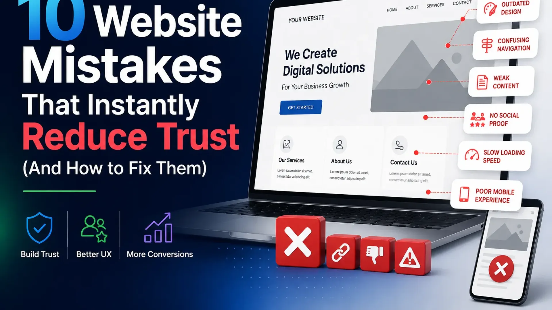
Let's look at the ten most common website mistakes that quietly push customers away—and how you can fix them.
Why Trust Matters More Than Ever
Consumers today have endless choices.
If your website feels confusing, outdated, or unprofessional, visitors don't hesitate—they simply open another tab.
Unlike a physical store where a salesperson can answer questions and build rapport, your website has to establish credibility on its own.
Trust is influenced by three key factors:
- User Experience (UX): Is the website easy to use?
- Psychology: Does it make visitors feel confident and comfortable?
- Branding: Does it communicate professionalism and consistency?
When these three elements work together, your website becomes a powerful sales tool.
1. An Outdated Website Design
People often associate the quality of your website with the quality of your business.
A design that looked modern five years ago may now make your company appear behind the times.
Common signs include:
- Small fonts
- Cluttered layouts
- Poor spacing
- Generic stock images
- Inconsistent colors
- Low-resolution graphics
A modern design doesn't need flashy animations—it needs clarity, balance, and professionalism.
How to Fix It
- Use clean layouts with plenty of white space.
- Stick to a consistent color palette.
- Invest in high-quality visuals.
- Use modern typography.
- Keep your design simple and focused.
Remember: visitors judge your business before they read your content.
2. Confusing Navigation
Nothing frustrates visitors faster than not knowing where to click.
If users struggle to find your services, pricing, or contact information, they'll leave.
Navigation should feel effortless.
Signs Your Navigation Needs Improvement
- Too many menu items
- Confusing labels
- Hidden pages
- Multiple dropdown levels
- Important pages buried deep
Best Practice
Limit your main navigation to the essentials:
- Home
- Services
- About
- Portfolio or Case Studies
- Blog
- Contact
The easier your website is to navigate, the more trustworthy it feels.
3. Weak or Generic Messaging
Many websites sound exactly the same.
"We provide innovative digital solutions."
"Customer satisfaction is our priority."
"Quality service at affordable prices."
These statements don't tell visitors why they should choose you.
Visitors want answers to three questions:
- What do you do?
- Who do you help?
- Why should I trust you?
Better Example
Instead of:
We build innovative websites.
Say:
We build conversion-focused websites that help businesses generate more leads and sales.
Clear messaging reduces uncertainty and builds confidence.
4. No Social Proof
People trust other people more than they trust marketing copy.
If your website lacks evidence that you've helped real clients, visitors become skeptical.
Add Trust Builders Like:
- Client testimonials
- Google reviews
- Case studies
- Client logos
- Before-and-after results
- Success metrics
- Industry awards
- Certifications
The more proof you provide, the easier it is for visitors to say yes.
5. Slow Loading Pages
Patience is short online.
If your website takes several seconds to load, visitors often leave before they even see your content.
A slow website creates two impressions:
- Your business isn't professional.
- Your business doesn't value users' time.
Improve Speed By:
- Compressing images
- Using faster hosting
- Removing unnecessary plugins
- Optimizing code
- Enabling caching
- Loading assets only when needed
Fast websites feel more reliable and improve both user experience and conversions.
6. Poor Mobile Experience
Most visitors now browse websites on smartphones.
Yet many business websites are still designed primarily for desktop users.
Common issues include:
- Tiny buttons
- Text that's hard to read
- Broken layouts
- Horizontal scrolling
- Slow mobile performance
If users struggle on mobile, they won't stick around.
Mobile UX Checklist
✔ Responsive design
✔ Easy-to-tap buttons
✔ Fast loading
✔ Readable typography
✔ Simple forms
✔ Optimized images
Mobile-first isn't just a trend—it's the standard.
7. Too Many Calls-to-Action
Some websites ask visitors to do everything at once.
- Book a demo
- Download an eBook
- Subscribe
- Watch a video
- Call now
- Chat with us
- Request pricing
When everything is important, nothing feels important.
Psychologists call this choice overload.
Too many options reduce decision-making.
Better Approach
Choose one primary goal for each page.
For example:
Homepage → Schedule a Consultation
Service Page → Request a Quote
Landing Page → Download the Guide
Focused pages convert better.
8. Inconsistent Branding
Imagine visiting a website where every page looks like it belongs to a different company.
Different fonts.
Different colors.
Different writing styles.
Different button designs.
This inconsistency subconsciously reduces trust.
Strong brands are consistent.
Keep Consistent:
- Logo usage
- Brand colors
- Typography
- Icons
- Photography style
- Button styles
- Tone of voice
Consistency creates familiarity—and familiarity builds trust.
9. No Human Element
People buy from people.
Many websites feel cold because they rely entirely on generic graphics and corporate language.
Visitors want to know who's behind the business.
Add Human Touches Like:
- Team photos
- Founder story
- Office images
- Behind-the-scenes content
- Customer success stories
- Personalized messaging
Authenticity creates emotional connection.
Even in B2B, people prefer working with businesses that feel approachable.
10. No Clear Next Step
One of the biggest trust killers is uncertainty.
Visitors shouldn't have to guess what happens next.
If they're interested, guide them.
Instead of ending pages with no direction, include a clear CTA like:
- Book Your Free Consultation
- Get a Custom Proposal
- Speak With Our Team
- Request a Website Audit
- Schedule a Demo
Then explain exactly what happens after they click.
For example:
"We'll review your requirements and get back to you within one business day."
Reducing uncertainty increases conversions.
The Psychology Behind Trust
Great websites don't just look attractive.
They reduce anxiety.
Every design choice either increases or decreases confidence.
Psychological principles that improve trust include:
Familiarity
People trust what feels familiar.
Use standard navigation patterns and recognizable layouts.
Simplicity
A clean website feels more professional than a cluttered one.
Remove unnecessary elements.
Focus on what matters.
Social Validation
Testimonials, reviews, and client logos reassure visitors that others have already made the same decision successfully.
Transparency
Clearly explain:
- Pricing (when possible)
- Process
- Timelines
- Deliverables
- Contact information
Transparency removes fear.
A Quick Website Trust Checklist
Ask yourself these questions:
- Does my homepage clearly explain what we do?
- Can visitors find information within a few clicks?
- Does the site load quickly?
- Is it mobile-friendly?
- Do we show testimonials and client results?
- Is our branding consistent?
- Are our CTAs clear?
- Do visitors know what happens next?
- Does the website feel modern?
- Would I trust this business if I saw it for the first time?
If you answered "no" to several of these questions, your website may be losing potential customers every day.
How Alternate Builds Trust-Driven Websites
At Alternate, we don't believe great websites are just about beautiful visuals.
They should create confidence.
Every project we build combines:
- User Experience (UX)
- Conversion Rate Optimization (CRO)
- Brand Strategy
- Modern UI Design
- Website Performance Optimization
- AI-Powered Features
- Mobile-First Development
- Analytics & Continuous Improvement
Our goal is simple:
Create websites that don't just attract visitors—they earn trust and generate business growth.
Final Thoughts
Trust isn't built through flashy animations or clever slogans.
It's built through thoughtful design, clear communication, consistent branding, and an effortless user experience.
Every small improvement—from faster loading times to stronger messaging—helps visitors feel more confident about choosing your business.
If your website isn't generating the leads or sales you expect, don't immediately assume you need more traffic.
First, ask yourself a more important question:
"Does my website deserve my visitors' trust?"
Fix that, and better conversions often follow.
Ready to Build a Website People Trust?
Whether you're launching a new brand or improving an existing website, Alternate helps businesses create digital experiences that inspire confidence, strengthen brands, and convert visitors into loyal customers.
Let's build a website that earns trust from the very first click.
These trust gaps are a big part of why a site gets traffic but no leads — here is the complete breakdown.
Related: if your site gets visitors but few enquiries, start with our full guide — why your website isn't generating leads (and how to fix it).
Tap the button and Google will show you our new articles more often — in Search, Top Stories and AI Overviews.
Have a project in mind?
Let’s turn it into an intelligent product. Book a free 30-minute discovery call.
Start your project →